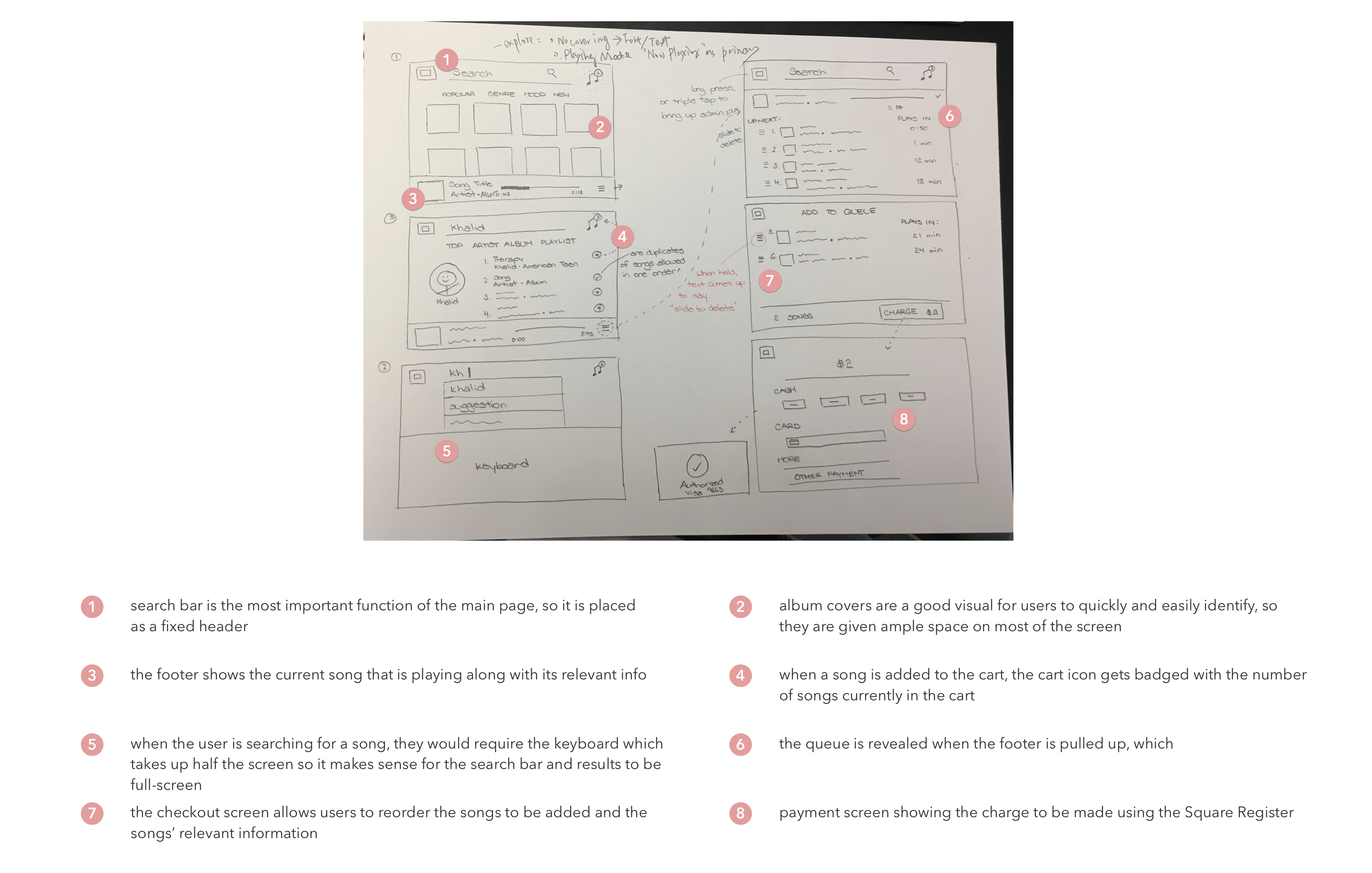
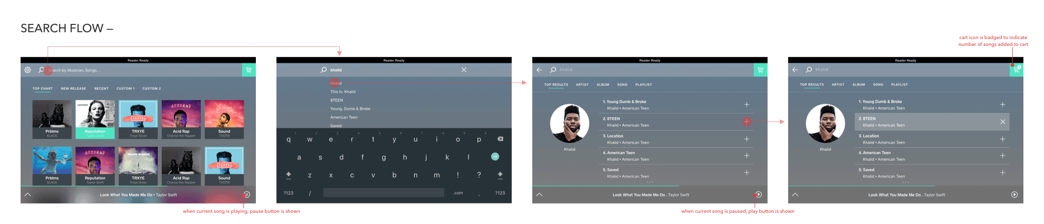
The main portion of the user interaction would happen in the request and checkout flow, so I made some lo-fi wireframes of that user flow. The typical user flow would be to start at the landing page and search for the song the user has in mind and add it to the cart to checkout.
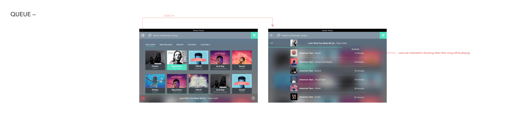
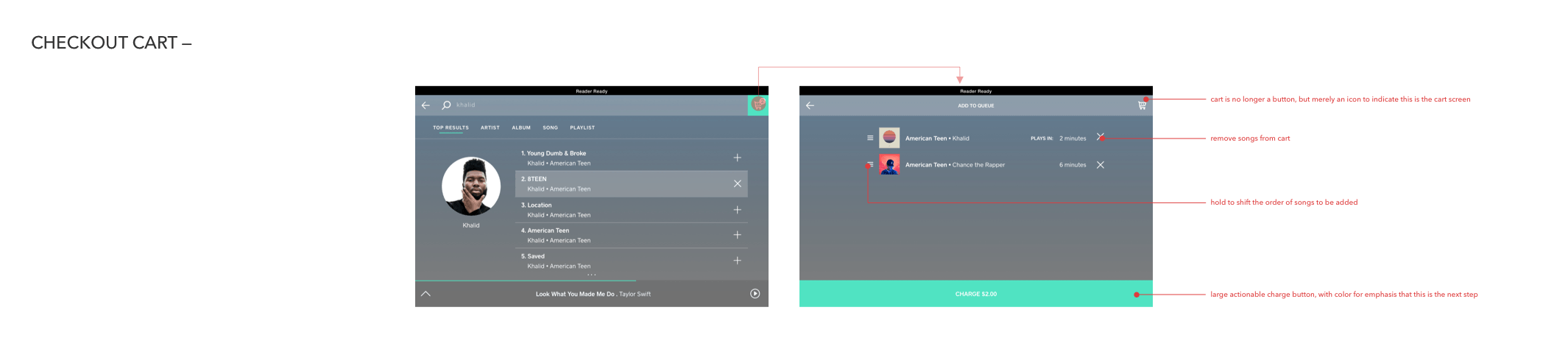
Since the foundational function of the app is to request songs, the search function is extremely important and so should be visible and accessible on all screens. Other important parts of the app that should also always be on the surface would be the cart and the current song playing bar, which includes the button to pull up the upcoming queue.
The admin controls would be accessed by holding down the home button and entering the admin passcode, which would satisfy Carl’s user needs.
However, for Bryan to see the current song, he has to look at the small footer at the bottom of the tablet. So, as an iteration, I thought that when the actual request flow is inactive, a full-screen display of the current song details would work well.

The success of DJ 9 would be measured by whether its addition increased the level of interaction with the cafeteria’s music and the enjoyment of the cafeteria environment. Since I had to leave the internship before the product could be fully implemented, I didn’t have the chance to actually get this feedback. But otherwise, I would survey cafeteria-goers to gauge their experience by asking them about how they felt about the music and general cafeteria experience before and after DJ 9.